
Missing the 10 Best Days
The Chart in Every Brochure
Every year the fund companies print the same chart. J.P. Morgan’s Guide to Retirement for 2026 has it on its page about being out of the market: $10,000 in the S&P 500 from 2 January 2006 to 31 December 2025 became $80,619, while an investor who missed the 10 best days of those twenty years ended with $35,866. Miss 20 and it is $21,177; miss 60 and the ten thousand has shrunk to $4,966. The lesson beside it: stay invested.
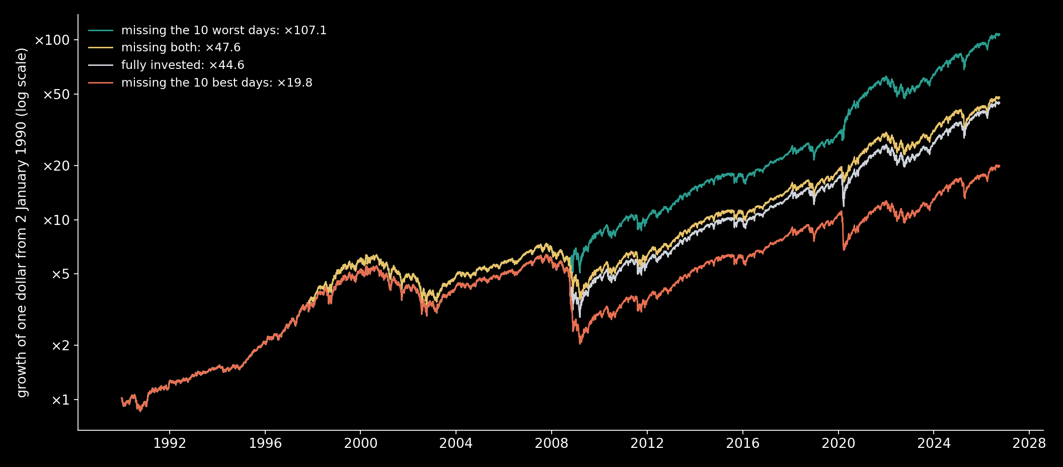
I replayed it over a longer stretch. One dollar in the S&P 500 at the start of 1990, dividends reinvested, held through all 9,255 trading days to 1 October 2026, became 44.6 dollars. Take away the 10 best days, leaving the money idle on each of them and invested on every other day, and it became 19.8. Ten days, about a tenth of one percent of the time, and more than half the money is gone. Parking the money in Treasury bills on those ten days instead of leaving it idle changes nothing: 19.8 either way.

The chart is true. It is also half a chart. It takes the investor out of the market on the best days and only on the best days, and the best days do not come alone.
The Other Half
Run the same replay the other way. Miss the 10 worst days instead, and the dollar becomes 107.1, 2.40 times what staying in gave. Miss both, the 10 best and the 10 worst, and it becomes 47.6: 1.07 times staying in, more than the investor who never blinked. With 20 days each way the gaps widen: 11.5 without the best, 194.6 without the worst, 50.1 without both.
Nobody could have missed only the worst days, and the next picture shows why. Here is every trading day since 1990, with the 10 best and the 10 worst marked.
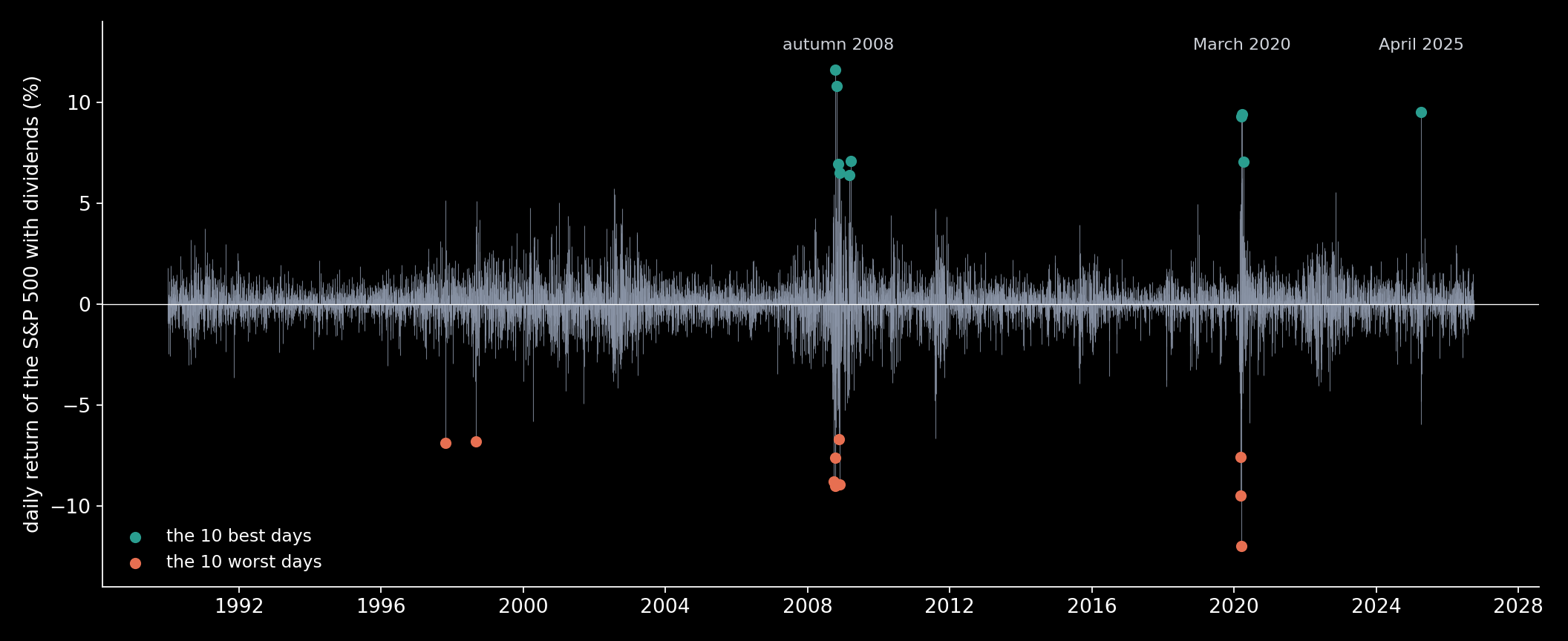
The best days are not scattered through the calm years. They sit in the middle of the worst storms, beside the worst days. The best day since 1990, 13 October 2008, up 11.6%, came two trading days before the third worst, 15 October 2008, down 9.0%. The fifth best, 13 March 2020, up 9.3%, came the day after the second worst, 12 March 2020, down 9.5%, and the trading day before the worst of all, 16 March 2020, down 12.0%.
Count them. Of the 10 best days since 1990, 4 fall within 5 trading days of one of the 10 worst, 6 within 10, and 7 within 21 trading days, about a month. Each of those 7 had a worst day in the month before it. The median best day sat 7 trading days from its nearest worst.
None of this is my discovery. The guide that prints the chart says so on the same page: “Six of the 10 best days occurred within two weeks of the 10 worst days”, and “Five of the six best days occurred after the worst days”. What is new here is the replay since 1990 and further back, and three pieces of mathematics that say why the chart comes out the way it does.
How Big Should the Best Days Be?
Start with the size of the loss. If the days were independent draws from one bell curve, how much should missing the 10 best cost?
The daily log returns since 1990 have a mean $\mu$ of 0.00041 and a standard deviation $\sigma$ of 0.0113, over $n$ = 9,255 days. The largest of $n$ independent normal draws sits near
and $\sqrt{2\ln n}$ is 4.27 here, which puts the best day near 5.0%. The rule of thumb runs high at this $n$. The exact expectation of the $j$-th largest of $n$ standard normal draws comes from its density,
integrated numerically, and it puts the expected best day 3.83 standard deviations above the mean: a gain of 4.5%. The real best day was 11.6%.
Add up the expected top 10 and the log sum is 0.382: missing them would leave 0.68 of the money, a cost of 32%. The real top 10 add up to 0.810, 2.12 times as much, and leave 0.44: a cost of 56%. A simulation of 2,000 independent normal histories of the same length agrees with the integral, 33.31 standard deviations for the top-10 sum either way.
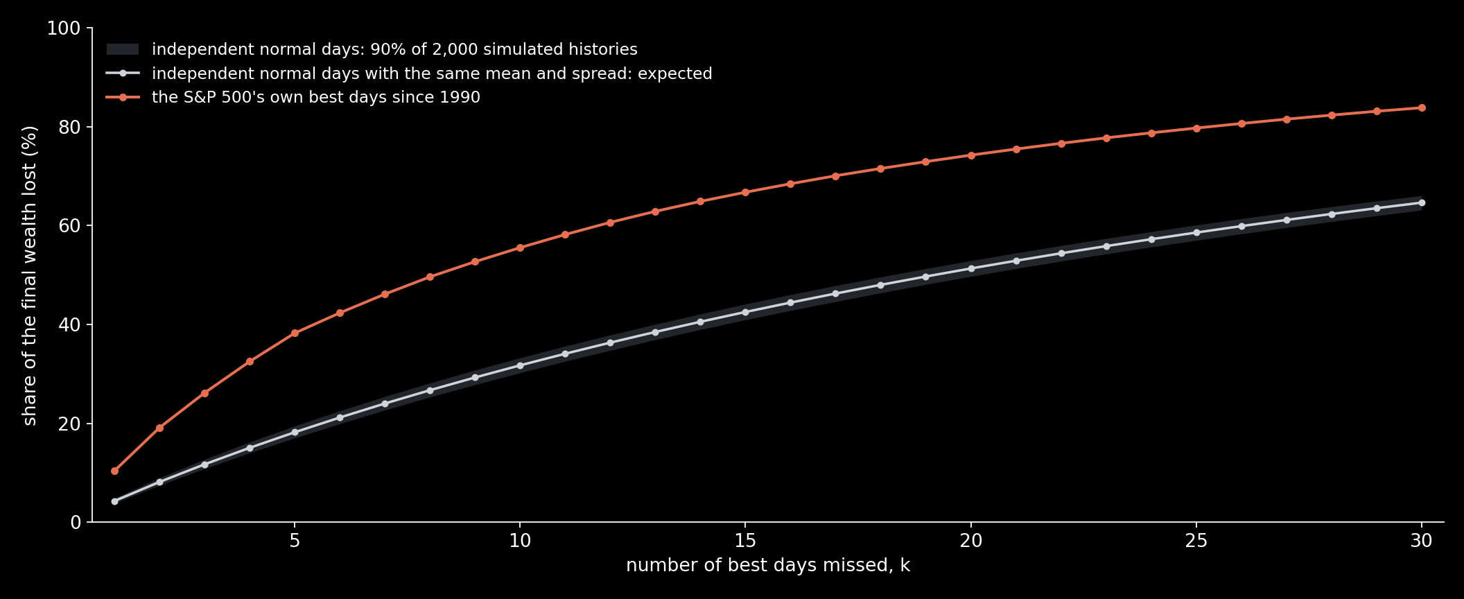
The real curve never comes near the band. Fat tails roughly double the damage: the market’s biggest days are far bigger than a bell curve allows, as Benoit Mandelbrot showed for cotton prices in 1963.
One thing the arithmetic does not care about is order. The final wealth is the exponential of the sum of the log returns kept, and a sum does not depend on the order of its terms. Shuffle the 9,255 days into any sequence and missing the 10 best still leaves 0.44. Order matters only to the question the chart never asks: which real investor misses them?
Algorithm — Replaying a History With Days Missed
input:  daily closes P(t); Shiller's annual dividend D of each month;
        the first day; the number k of days to miss
r(t) ← (P(t) + D/252) / P(t−1) − 1       the day's return, dividend in
ℓ(t) ← ln(1 + r(t))
B ← the k days with the largest ℓ(t);  S ← the k days with the smallest
W       ← exp( Σ ℓ(t) over every day )            fully invested
W best  ← exp( Σ ℓ(t) over the days not in B )    idle on the best days
W worst ← exp( Σ ℓ(t) over the days not in S )    idle on the worst days
W both  ← exp( Σ ℓ(t) over the days in neither )
check: the bill rate on the missed days in place of nothing
A Best Day and a Worst Day Cancel, Almost
Now the stranger result: missing both ends left more money than staying in. A day up by $x$ and a day down by $x$ are not a wash,
so a matched pair costs $x^2$, and removing it adds $-\ln(1-x^2) \approx x^2$ to log wealth. The real best and worst days do not pair off exactly. In general, removing the $k$ best returns $b_i$ and the $k$ worst $w_i$ changes log wealth by
Since 1990, with $k$ = 10, the best days add up to +84.5% and the worst to −83.8%. In plain addition they almost cancel: the drift part is −0.0078. The variance part is +0.0736. With a remainder of 0.0002 from the higher terms, $\Delta$ = 0.066, and $e^{0.066}$ is 1.07: the investor who missed both ends finished 7% ahead.
This is Itô’s correction, removed a few days at a time. Log wealth grows by the sum of the returns minus half the sum of their squares, the $\sigma^2/2$ drag that Four Hundred Dollars or Nine Cents watched eat leveraged funds. Since 1990 that drag came to 0.594 in log terms. The 20 extreme days are 0.22% of the days and carry 12.4% of it. Missing both ends cuts out a slice of the drag and gives up almost no drift.
Seven Where Chance Gives Half of One
How surprising is the clustering? Suppose the $m$ worst days had fallen at random among the $n$. A best day has a window of $2w+1$ days around it, $w$ on each side and itself, and a worst day lands in it with probability about $(2w+1)/n$. With the $m$ worst days falling independently,
The approximation ignores the two ends of the history and the fact that a worst day cannot fall on the best day itself; neither matters at this $n$. With $w$ = 21, $m$ = 10 and $n$ = 9,255, we should expect 0.46 of the 10 best days to have a worst day within a month. We saw 7. Within 10 trading days chance gives 0.22 and we saw 6; within 5, chance gives 0.12 and we saw 4.
The days are not independent, in one particular way. Their direction is close to unpredictable, but their size is not: big moves come in storms, and a storm brings big days of both signs. It is called volatility clustering, and Mandelbrot described it in the same 1963 paper. The best days are a storm’s rebounds, and they come in the same weeks as its crashes.
Is 1990 special? Here are three starting points.
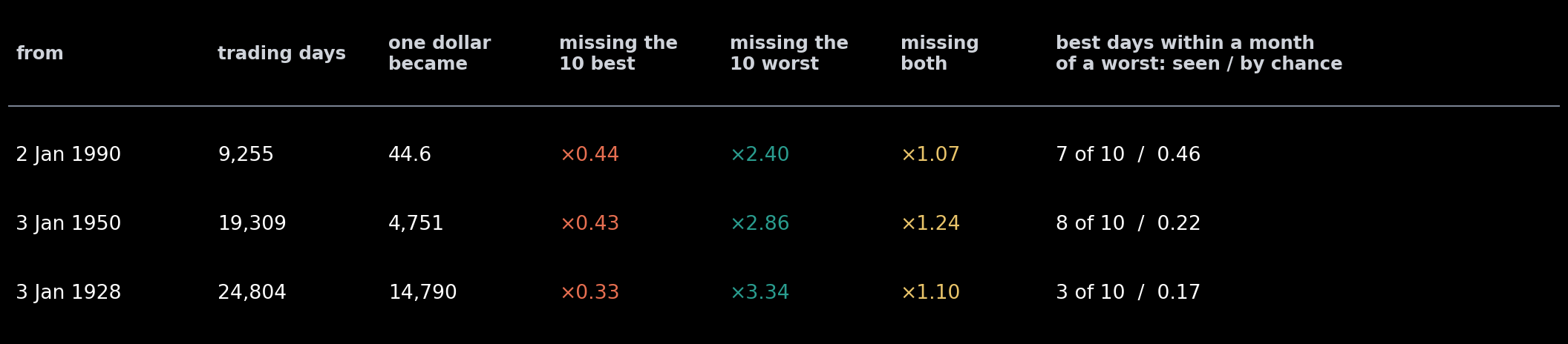
Since 1950 the picture holds: missing the 10 best keeps 0.43, missing the 10 worst multiplies by 2.86, missing both by 1.24, and 8 of the 10 best fall within a month of a worst, where chance gives 0.22.
Since 1928 the arithmetic holds and the clustering does not. Missing the best keeps 0.33 and missing both still beats staying in, at 1.10, but only 3 of the 10 best fall within a month of a worst. Eight of the ten best days since 1928 came between 1929 and 1939, and so did six of the ten worst, and the median best day sat 296 trading days, more than a year, from its nearest worst. In the 1930s the storm lasted a decade, and inside it the best and the worst days were spread over years, not weeks.
What the Chart Gets Right
Nobody can miss only the worst days. The worst and the best arrive in the same storms, and on the morning nobody can tell which one is coming. The investor who misses the best days is not unlucky with the calendar. That investor sold in the storm, after a worst day, and was still out when the rebound came.
So the chart’s advice holds, for a different reason than it suggests. Staying in does not win because ten precious days are scattered through the calm years; missing both ends would have done slightly better than staying in. It wins because the only realistic way to miss the best days is to run from the worst ones, and the storm that makes you run is the one that brings the rebound. The guide says it plainly on the same page: “Taking “control” by selling out of the market after the worst days is likely to result in missing the best days that follow.”
When to get in and when to get out on purpose are other questions, and earlier posts measured them on the same index: Should You Wait for a Dip? and What a Stop-Loss Costs.
Sources
- J.P. Morgan Asset Management, “Impact of being out of the market”, Guide to Retirement, 2026 edition, page 41 (data as of 31 December 2025).
- paveljurke, “S&P 500 (^GSPC) Historical Data”, Kaggle dataset (CC0), daily closes from Yahoo Finance.
- R. J. Shiller, monthly stock market data: S&P Composite price, dividends and the 10-year Treasury yield, 1871 to the present (ie_data.xls), shillerdata.com.
- Board of Governors of the Federal Reserve System, 3-Month Treasury Bill Secondary Market Rate (DTB3), retrieved from FRED, Federal Reserve Bank of St. Louis.
- H. A. David and H. N. Nagaraja, Order Statistics, 3rd edition, Wiley (2003).
- B. Mandelbrot, “The variation of certain speculative prices”, The Journal of Business 36 (1963) 394–419.
Every number in the text and the charts is computed by the script archived with this post, from the daily closes, dividends and bill rates above, once, into a saved results file.
Interested in applying these ideas to your work? Get in touch.