
The IQ Map That Filled Its Own Blanks
Two Hundred Colours
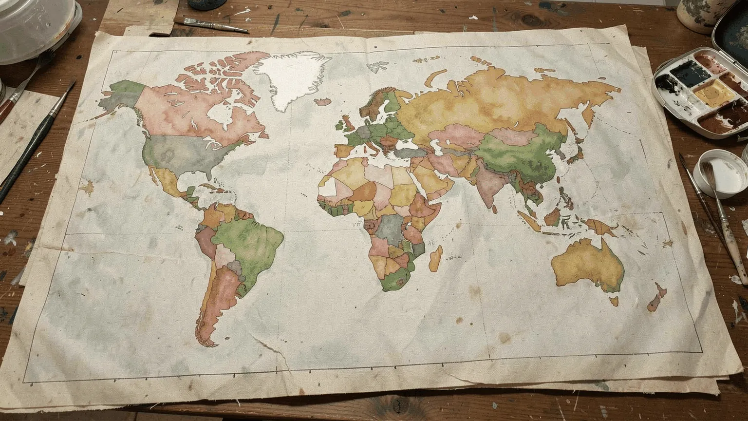
Every few months a world map comes round again, each country coloured by its average IQ. Two hundred countries, two hundred colours, and every one of them looks equally sure of itself.
They are not equally sure. Behind the colour of the United States stand 62,296 people in 57 samples, tested between 1945 and 2013. Behind Angola’s stand nineteen. Behind fifty countries stand nobody at all: their colour was copied from the country next door.
The table is public, sample by sample, and it can be read like any other dataset: who was tested, how many, when, and what was done where nobody was. That is what this post does.
The Table Behind the Map
The table began in 2002 with Richard Lynn and Tatu Vanhanen’s IQ and the Wealth of Nations, which had measured figures for 81 countries and estimated the rest. Its current version, the NIQ-DATASET V1.3.5 of October 2023, is kept by David Becker of Chemnitz University of Technology, Lynn’s co-author on The Intelligence of Nations (Ulster Institute for Social Research, 2019). It is published as a spreadsheet that shows its working: every sample, its size, its test, its year, every correction applied and the study it came from.
It gives 200 countries a figure, and the figures are of three different kinds:
- For 130 countries, people were actually given IQ tests. In 82 of them, the test results are averaged with school-test scores converted to the IQ scale.
- For 20 countries, nobody took an IQ test. The figure is the converted school tests.
- For the remaining 50, there is no data of either kind. The figure is copied from the neighbours.
The tested countries hold most of the world. By the dataset’s own population figures, 93.5% of people live in a country where someone was IQ-tested, 1.6% in one known only from school tests, and 5.0% in one whose number was borrowed.
Here is the map with the three kinds drawn differently. Solid colour is a tested country, dotted is school tests only, hatched is a copy. Hover over a country, or tap it on a phone, to see what stands behind its number.
Nineteen, Thirty-Four, Forty
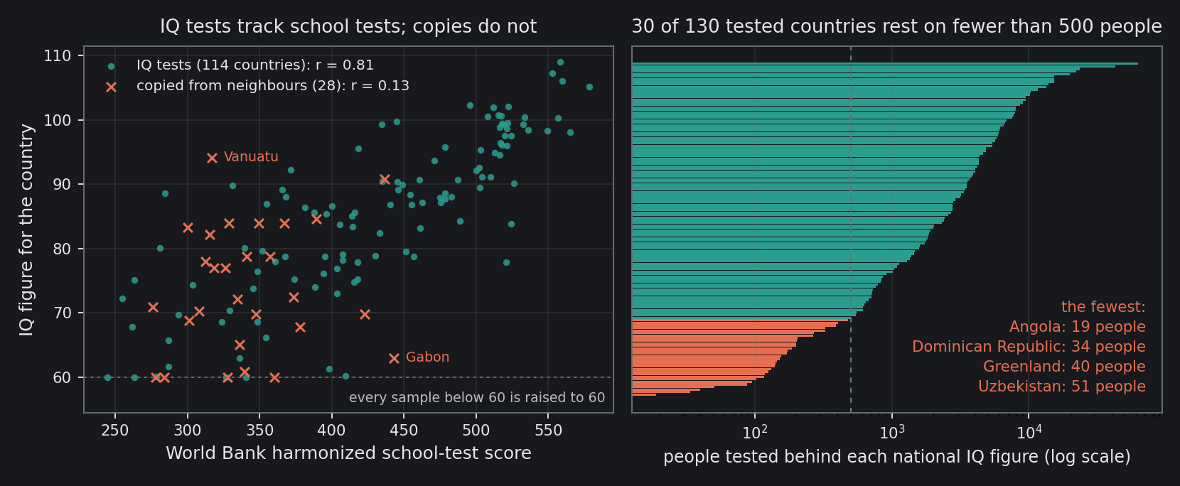
Among the 130 tested countries, the median figure rests on 1,968 people. That is a respectable sample. The tail is not: 30 national figures rest on fewer than 500 people, 6 on fewer than 100, and 32 on a single sample.
The thinnest are these:
- Angola, 19 people. Healthy young adults, aged 15 to 32, who served as the control group in a 2013 pilot study at Benguela Central Hospital on the after-effects of cerebral malaria. Each sat two subtests of a Wechsler adult intelligence scale: repeating strings of digits, and completing patterns. They became the national IQ of a country of more than thirty million people. An earlier version of the figure, in Lynn and Vanhanen’s tables, went one step further: for the pattern test it averaged the controls’ score with that of the 22 patients who had survived cerebral malaria.
- The Dominican Republic, 34. The healthy relatives of ten adults with complete androgen insensitivity, a rare genetic condition, tested in 1982 for a study in clinical endocrinology. They scored well above 100 on a Spanish-language Wechsler scale normed in Puerto Rico in 1965; the dataset’s correction for the origin of those norms brings it to 89.2. Averaged with the country’s school tests, 74.4, the national figure is 81.8.
- Greenland, 40. Inuit children in Thule, aged 6 to 12, tested in 1995 for a study of prenatal exposure to mercury. The dataset uses a single subtest, having set the other aside on the grounds that the mercury might have affected it.
- Uzbekistan, 51. Ethnic Uzbek children aged 10 to 15, tested in 2013. In Kazakhstan.
- The Republic of the Congo, 88. Schoolchildren in Brazzaville, from a 1994 study of how much people improve when they take the same test twice.
Most of these studies were about something else: malaria, hormones, mercury, practice effects. The table collects whatever samples exist, and where only one exists, that one is the country.
Copied From Next Door
Fifty countries have no data at all, and the dataset fills them from the neighbours. It takes the three longest borders (for an island, three nearby countries) and averages the neighbours’ figures, weighted by the length of border they share. A neighbour that is itself blank counts for nothing.
So Chad is Sudan. Of Chad’s three longest borders, two lead to countries nobody tested either, the Central African Republic and Niger. The third leads to Sudan, and Chad’s figure is Sudan’s to the decimal: 78.0.
North Korea is mostly China: 1,352 km of shared border, against 237 km with South Korea and 18 km with Russia. The weighted average is 102.8, which puts North Korea, where nobody was tested, just above South Korea’s 102.6, where many were.
Gabon is Brazzaville. Its other long borders lead to Cameroon and Equatorial Guinea, which were not tested, so Gabon takes the Republic of the Congo’s 63.0 whole. A country of more than two million people carries the score of 88 schoolchildren in a neighbouring capital, tested thirty years ago.
The Floor at Sixty
There is one more rule, and it sits in a single cell of the workbook: any sample scoring below 60 is raised to 60. It applies to 42 samples in 17 countries, 21,782 people in all.
Sierra Leone’s national figure is that rule. It rests on two samples, 119 Temne people aged 10 to 40, tested in 1966 with a pattern-completion test for a study of perceptual skills. On the test’s British norms they scored 39.2 and 40.9, and 44.6 and 46.4 after the dataset’s adjustment for the age of those norms. Both were raised to 60, and Sierra Leone’s figure is 60.0 exactly.
Then the floor travels. Liberia was never tested, and takes Sierra Leone’s figure. Guinea, Senegal, Mauritania and Cape Verde were never tested either, and are filled from Sierra Leone, Mali and the Gambia, whose own figures sit at the floor. Five countries where nobody sat a test carry a number that no test produced: the bottom of the scale, copied.
The floor only ever raises a figure. Without it, the lowest national numbers would be lower, not higher.
The Numbers That Hold
By now the table might look like noise with a colour scheme. It is not, and there is a clean way to see it.
In 2021 a World Bank team published harmonized learning outcomes: the results of international and regional school tests, from PISA and TIMSS to the regional assessments of Africa and Latin America, put on a single scale for 164 countries holding 98% of the world’s population. Different children, different tests, a different purpose. If the IQ figures were noise, they would not line up with it.
The comparison has to be made with care. For 82 countries the national figure already averages in school tests, and comparing school tests with school tests only proves they agree with themselves. My first pass made exactly that mistake and got a correlation of 0.87; the school-test part alone agrees with the World Bank at 0.97. So the check below uses the IQ tests alone.
Across the 114 countries that have both, the IQ tests correlate with the World Bank’s school tests at r = 0.81. The countries that score low on one score low on the other, and the countries that score high on one score high on the other. The measured part of the map, thin samples and all, is measuring something real.
The copies are another matter. Across the 28 copied countries that have school-test data of their own, the correlation is 0.13, indistinguishable from zero: the 95% interval runs from −0.25 to 0.48. Gabon, given Congo’s 63.0, has school results that would put it near 87 on the line the tested countries follow, so its copy is 24 points low. Vanuatu, in the Pacific, is averaged from the Marshall Islands, Australia and New Zealand to 94.2; its school results would put it near 72, so its copy is 22 points high.
Read the Hatching
So the map is two maps printed in the same colours. One is a measurement. For 93.5% of the world’s population it rests on people who were tested, and it agrees with an independent set of school tests about as well as two different measures of anything ever do. The other is a guess, copied across borders, and it agrees with nothing.
Nothing on the usual map says which is which. The next time it comes round, look for the hatching, and if it is not there, ask what is behind the colour. Sometimes it is sixty thousand people. Sometimes it is nobody, and the colour came from next door. And sometimes it is nineteen people who went to a hospital in Benguela to help a study of malaria, and never knew they had become Angola.
Sources
- D. Becker, NIQ-DATASET V1.3.5 (October 2023), viewoniq.org: the workbook every number here is computed from, including the sample notes quoted above.
- R. Lynn and T. Vanhanen, IQ and the Wealth of Nations (2002).
- R. Lynn and D. Becker, The Intelligence of Nations (2019).
- N. Angrist, S. Djankov, P. K. Goldberg and H. A. Patrinos, “Measuring human capital using global learning data”, Nature 592 (2021) 403–408.
- B. Peixoto and I. Kalei, “Neurocognitive sequelae of cerebral malaria in adults: a pilot study in Benguela Central Hospital, Angola”, Asian Pacific Journal of Tropical Biomedicine 3 (2013) 532–535.
- J. W. Berry, “Temne and Eskimo perceptual skills”, International Journal of Psychology 1 (1966) 207–229.
Every number here is computed by the script archived with this post.
Interested in applying these ideas to your work? Get in touch.