
The Best of 490 Backtests Is Noise
A Beautiful Curve
Here is how a trading strategy is usually born. You write down a rule with a few knobs — a lookback, a threshold, a stop, a target. You run it over a year of data. It loses money. So you turn the knobs: five settings for one, seven for another, a handful for the rest. Somewhere in that grid of a few hundred variants, one of them produces a gorgeous equity curve with an annualised Sharpe ratio near three.
It feels like discovery. It is not. It is arithmetic, and the arithmetic is worth doing once, carefully, because after you have done it you will never look at a backtest the same way.
One Year, One Number
Start with a single variant and ask how well a year of daily returns can measure its Sharpe ratio. With $n$ daily observations and a true Sharpe near zero, the standard error of the annualised estimate is
$(1)$
One year of data, one full unit of noise. A strategy with no edge at all will report an annualised Sharpe somewhere in the band from minus one to plus one about two thirds of the time — and outside it the rest of the time. That is the resolution of the instrument. Nothing about the strategy has been learned yet; this is simply what a year can and cannot tell you.
The Arithmetic of the Maximum
Now run the grid. Suppose every one of $N$ variants is pure noise — no edge in any of them — so each reported Sharpe is an independent draw from a standard normal. You do not look at all $N$. You look at the best one. The quantity you are admiring is the maximum of $N$ standard normals, and its expected value is an integral you can evaluate exactly:
$(2)$
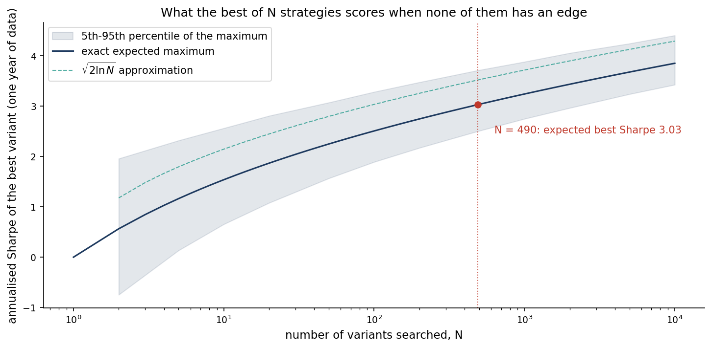
For $N = 490$ — a modest grid, five knobs at a few settings each — this comes to 3.03. The familiar approximation $\sqrt{2\ln N}$ gives 3.52 and overstates it; the integral is the honest number. The spread matters too: the standard deviation of that maximum is about 0.37, so the best of 490 noise strategies lands above a Sharpe of 2.5 roughly ninety-five per cent of the time, and above 3.5 about one time in ten.
Read that again with the grid in mind. A reported Sharpe of 2.5 from a 490-point search is not evidence of anything. Three is not a lucky find; three is the expected outcome of searching noise. The beautiful curve is exactly what you would see if the strategy had no edge whatsoever — it is what the search produces, not what the market does.
Seeing It
The expected maximum grows only logarithmically in $N$, which is why a bigger search never fixes the problem and always deepens it. The figure computes the exact expectation for grids from one to ten thousand variants, checks it against a Monte Carlo band, and marks the grid of 490.
Python 3.13 — Expected Maximum of N Noise Sharpe Ratios
import numpy as np
import matplotlib
matplotlib.use("Agg")
import matplotlib.pyplot as plt
from scipy import integrate, stats

NAVY, TEAL, RED = "#1e3a5f", "#2a9d8f", "#c0392b"

def expected_max(N):
    # E[max of N iid standard normals], exact by quadrature
    f = lambda x: x * N * stats.norm.pdf(x) * stats.norm.cdf(x) ** (N - 1)
    return integrate.quad(f, -12.0, 12.0)[0]

Ns = np.unique(np.round(np.logspace(0, 4, 60)).astype(int))
exact = np.array([expected_max(int(N)) for N in Ns])
Na = Ns[Ns >= 2]                                  # the approximation is only defined for N >= 2
approx = np.sqrt(2.0 * np.log(Na))

# Monte Carlo band: 5th-95th percentile of the maximum, for a coarser set of N
rng = np.random.default_rng(0)
Nmc = np.array([2, 5, 10, 20, 50, 100, 200, 490, 1000, 2000, 5000, 10000])
lo, hi = [], []
for N in Nmc:
    m = rng.standard_normal((20000, N)).max(axis=1)
    lo.append(np.quantile(m, 0.05)); hi.append(np.quantile(m, 0.95))

fig, ax = plt.subplots(figsize=(10, 5), facecolor="white")
ax.fill_between(Nmc, lo, hi, alpha=0.12, color=NAVY, label="5th-95th percentile of the maximum")
ax.plot(Ns, exact, color=NAVY, lw=1.5, label="exact expected maximum")
ax.plot(Na, approx, color=TEAL, lw=1.0, ls="--", alpha=0.8, label=r"$\sqrt{2\ln N}$ approximation")
e490 = expected_max(490)
ax.axvline(490, color=RED, lw=1.0, ls=":", alpha=0.8)
ax.scatter([490], [e490], color=RED, zorder=5)
ax.annotate(f"N = 490: expected best Sharpe {e490:.2f}", (490, e490),
            xytext=(16, -28), textcoords="offset points", fontsize=10, color=RED)
ax.set_xscale("log")
ax.set_title("What the best of N strategies scores when none of them has an edge", fontsize=12)
ax.set_xlabel("number of variants searched, N", fontsize=11)
ax.set_ylabel("annualised Sharpe of the best variant (one year of data)", fontsize=11)
ax.tick_params(labelsize=9)
ax.legend(fontsize=10, framealpha=0.7, loc="upper left")
ax.spines["top"].set_visible(False)
ax.spines["right"].set_visible(False)
plt.tight_layout(pad=1.5)
fig.savefig("fig_1.png", dpi=150, bbox_inches="tight")
plt.close()
What Survives
None of this says backtesting is useless. It says the reported number is meaningless until you know how many times you looked. Four things restore meaning.
Count every trial — including the variants you discarded, the ones you ran and disliked, the ones you ran twice with a tweak. The trial count is the denominator of your evidence, and it is the number most reports quietly omit.
Deflate the Sharpe. Bailey and López de Prado’s deflated Sharpe ratio asks the question the figure answers: given $N$ trials, how surprising is the best result? Harvey, Liu and Zhu reach the same conclusion from the other direction — in a field this heavily searched, a t-statistic of two is nowhere near a high enough bar.
Show the noise band beside the result. Run a few hundred random traders on the same data with the same friction, and draw where they land. If your strategy sits inside their band, you have found nothing, however lovely the curve.
Buy resolution with time, not with search. Equation (1) says the noise shrinks as $1/\sqrt{\text{years}}$: four years of data halve it, and no number of extra variants does. A search makes the best curve prettier; only data makes it truer. And what you want at the end is a plateau of settings that all work, never a single peak — a peak is where the noise lives.
Why This Is Here
This post is the first rule of a small project we are starting, where trading rules are tested on real market data and the results are shown with the receipts — and every result appears beside the band that noise alone would have produced. The code will sit on GitHub, so the arithmetic above is something you can run rather than take on trust.
Working on a pricing model or risk system? Let’s talk.